Branding
Various past branding examples with recent work omitted.
I’ve had the privilege to assist a few companies with the defining characteristics of their brand; beyond the logo, colors, or typography, I've sought to understand each enough to replicate it before building off that identity. There have been many instances where we started from scratch and too many to include below, but here are a few examples from this collection.
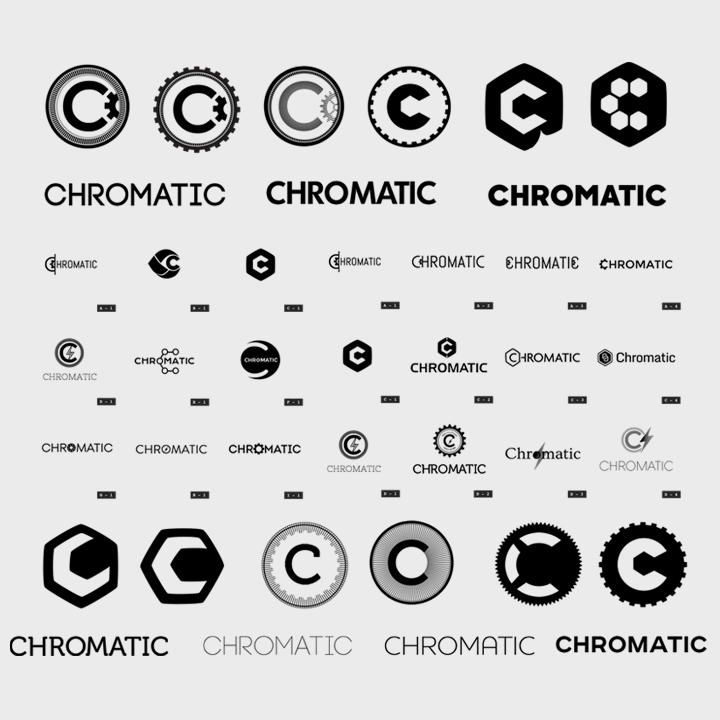
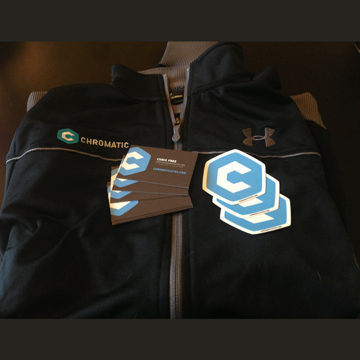
CHROMATIC
The group at CHROMATIC is an excellent team of developers, designers, and business managers. At the time, I had worked with them as a designer prior to helping with their identity. In their case, we kept a color scheme and caps lettering similar to the previous brand, but grew the mark into a more symbolic representation of the complexity underlying the application. Below shows some of the early ideation and narrowing towards the bolted “C” and prominent name adjacent.

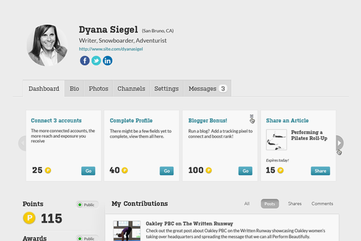
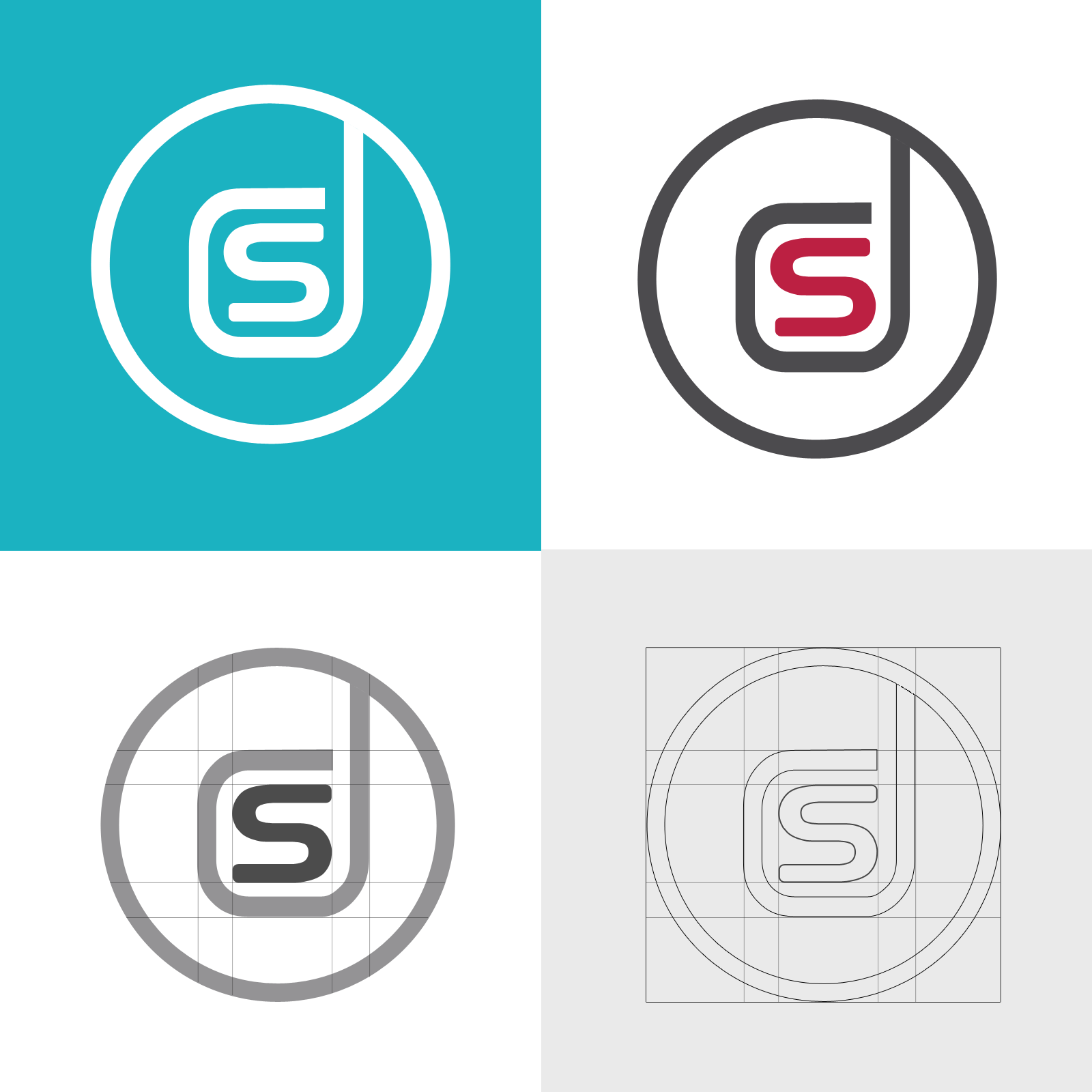
Dynamic Signal
At Dynamic Signal, they needed an updated native app logo to fit a square aspect ratio and scale in vector formats. I captured their iconic “s” inside “d” while streamlining the line-width and continuing it into the surrounding circle, providing a buffer for the mark and symmetry across a smaller range of sizes. Our marketing team also introduced a teal blue which was incorporated into a later version.
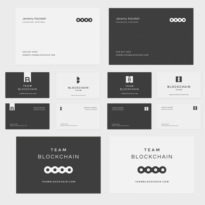
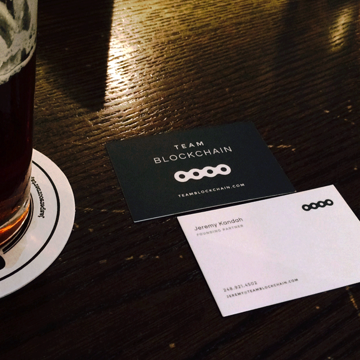
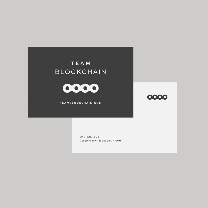
Team Blockchain
For Team Blockchain, we created a new identity for a bitcoin angel fund. In this example, the chain, dollar, and vault metaphors are used to imply the financial backing and continuation for potential. We settled on a mark closest to the chain metaphor which could be used to underline or offset the brand name itself.
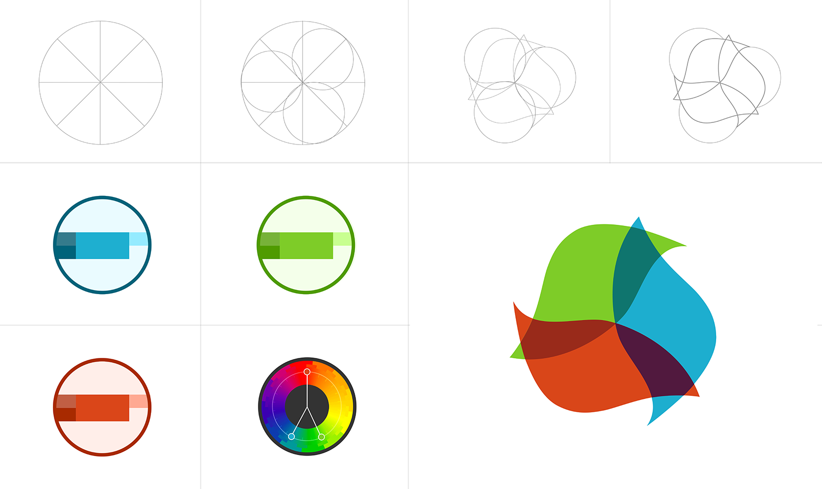
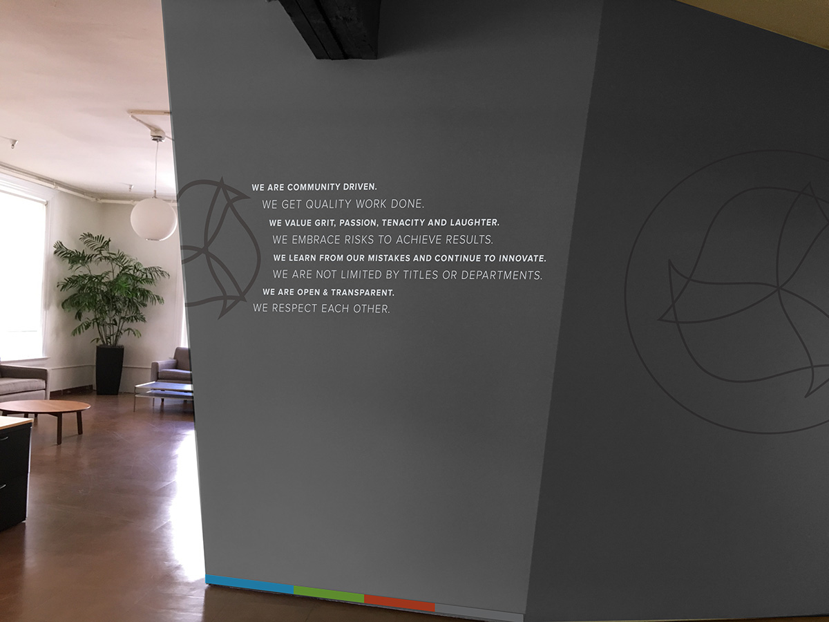
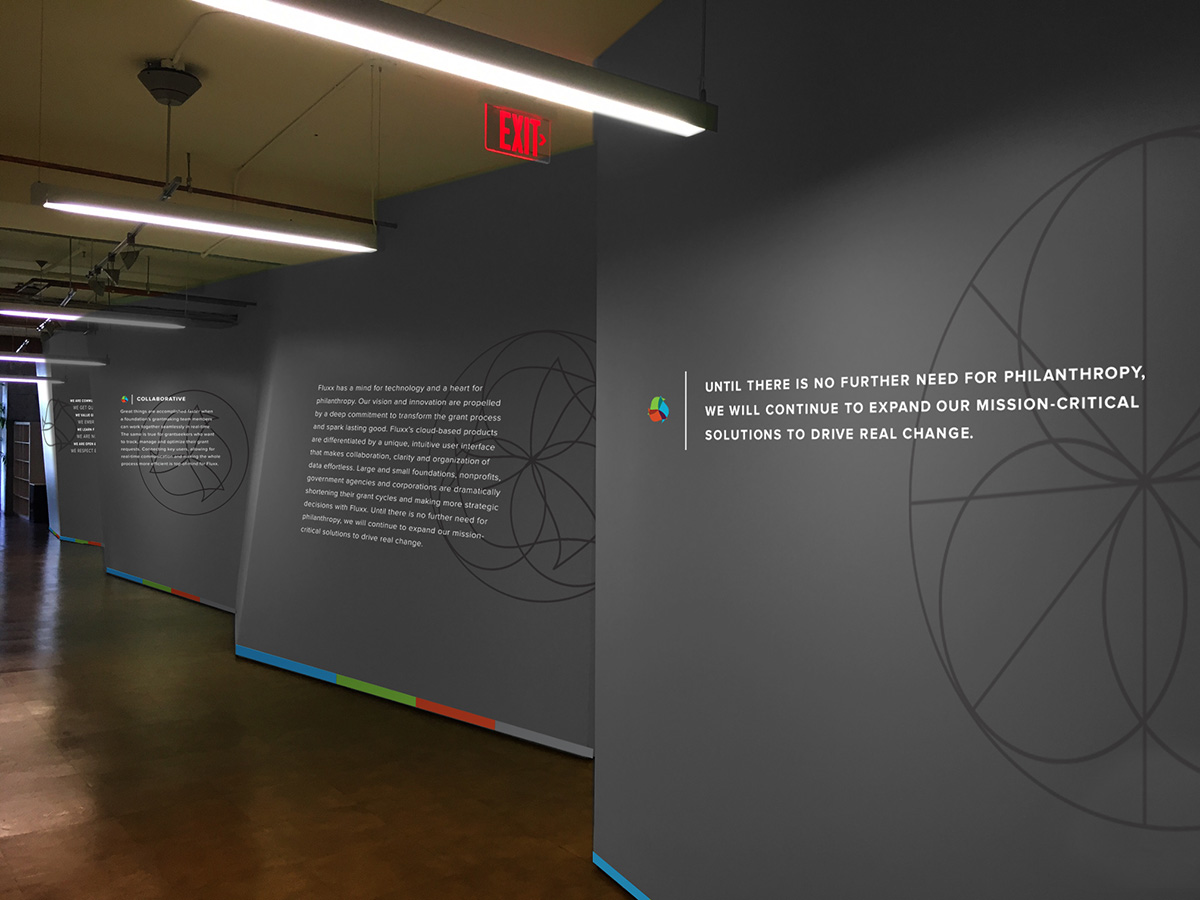
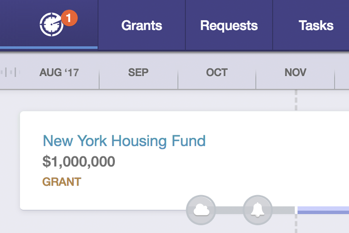
Fluxx
At Fluxx, the update I provided focused on unifying the colors and updating the mark for vector. In doing so, I created a deconstructed version of the logo to improve the symmetry and explore ways to show a silhouette monochrome logo. We would later go on to use the logo wireframes to highlight company values on the walls surrounding the office.